Always Understand Your Data
One of the difficulties of the current recession is how fast it is moving. It has forced economics to find new higher frequency data to try and estimate both the impact and the recovery.
A few weeks ago, I used Apple data to try to estimate the recovery. It showed that driving was back to normal. However, that seemed not true to be based on traffic on Google and what I was seeing.
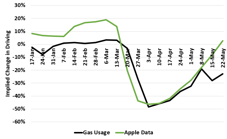
Here is a graph comparing the year-over-year change gasoline deliveries (i.e. demand) vs. the Apple data.

You can see that they kind of match until the last few weeks. There is no way driving can be back to normal but gas demand is down.
So what’s the issue? There are two:
- The Apple data uses Jan 13th as a baseline. More driving happens in the summer so the baseline is too low.
- This is looking at the number of requests for driving directions. Given a lot of people are getting deliveries, my guess is that there is a huge surge in requests for directions relative to driving.
It’s important to understand your data so you can interpret it properly.