The big thing these days is to blame the Fed for the falling stock market. The Fed isn’t just raising rates – no no no – it’s also tightening because it is letting the size of the balance sheet fall. So it’s DOUBLE TIGHTENING. News Flash: The idea the Fed’s balance sheet has anything to do directly with stock returns is… garbage.
Let’s begin with this: From 1996 to now, the correlation between the year over year change in the size of the Fed balance sheet and the weekly S&P 500 return (we get weekly balance sheet information) is…. 0.00. Yes, you read that right. 0.00. The correlation between the weekly change in the Fed balance sheet and the weekly S&P 500 return is… -0.13.
OK so let’s start before Sept 2008 when things started getting crazy. Here is the year-over-year (YoY) chance in the balance sheet from 1996 to 2008.
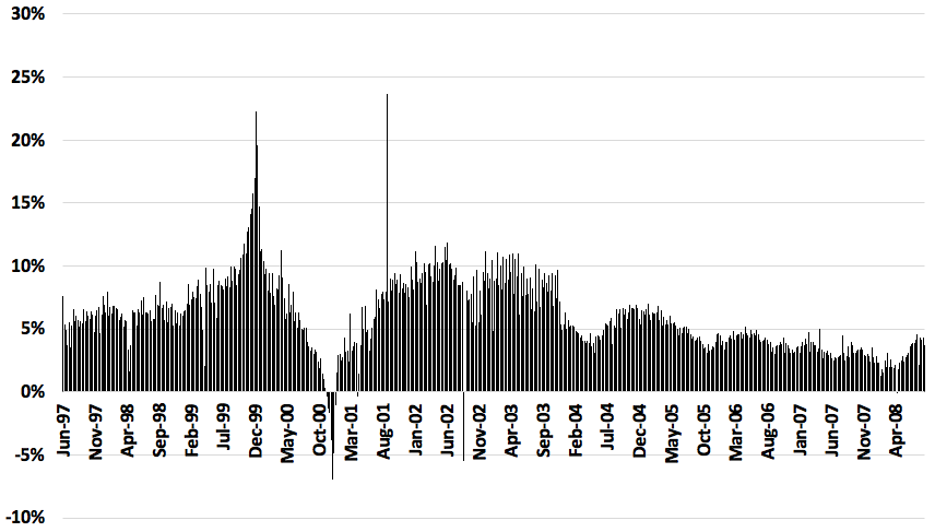
So we see the size of the balance sheet over this period was almost always expanding YoY. You see three funny things:
- The Fed added a lot of liquidity to the market at the end of 1999 in case there were any Y2K issues.
- This lead to a negative YoY change at the end of 2000 since nothing happened and the Fed removed that liquidity.
- You see a big spike on 9/11 in 2001.
Other that that, it’s about 5-10% per year consistently. So it’s pretty hard to expand stock market changes if the variable of interest never changes. In 2000, the market peaked in April and was down over 10% before the Y0Y change in the balance sheet went negative. Here’s the Y-o-Y Chance in the S&P 500 over the same period.
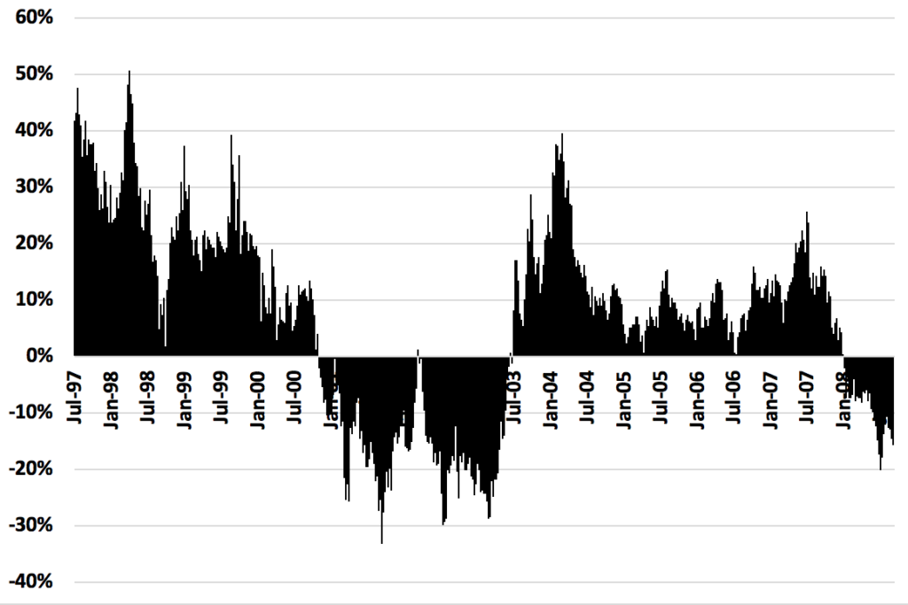
So the balance sheet was going UP in 2008 as the S&P 500 crashed. Also please note going in to Sept 2008 the balance sheet was STILL EXPANDING. So as the market is crashing into 2009, the Fed didn’t reduce the balance sheet at all before hand. Therefore you can’t argue there is any Lead-Lag stuff going on. Just generally, look at those two figures. Do those two figures look like they have any correlation to each other? No.
OK so what happened after Sept 2008 with the balance sheet:
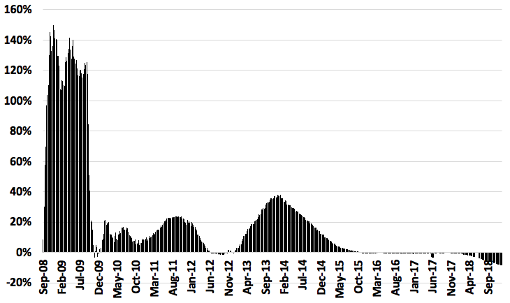
We had a HUGE expansion at the end of 2008-2009. By March 2009, the balance sheet expanded by more than 125% – from $900 billion to over $2 trillion – while the market crashed. In 2011 when QE2 was going, the market was only up 2% while the market was up 12% and 22% in 2016 and 2017 when there was no expansion.
Face it, there is no correlation between the size of the balance sheet and stock market returns. And that’s because of how the Fed works, which I’ll get to in my next post.
