Which One of These Doesn’t Look Like the Other

A very surprising jobs report this morning. The economy added 2.5mm jobs last month!

Why is this so surprising? All the other data says the economy lost jobs last month. This graph shows the number of new jobless claims, the change in continuing claims, and then the change in jobs reported by the employment report.
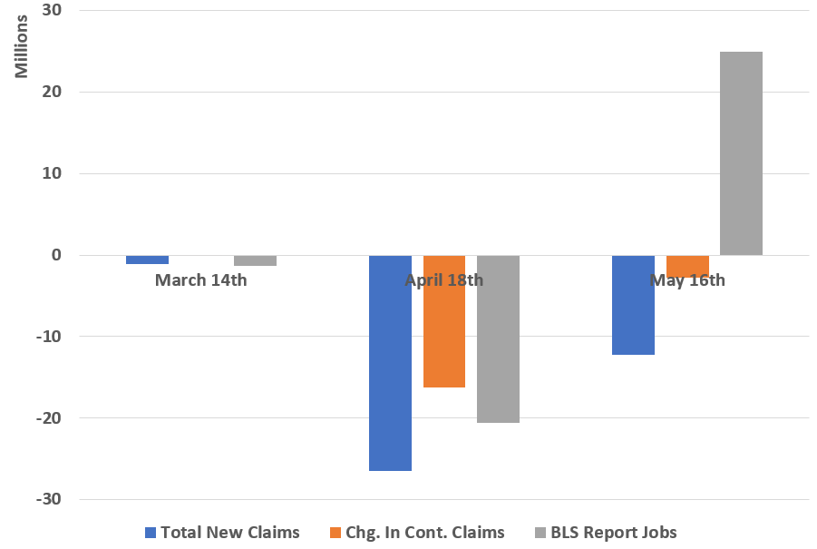
Comparison of Jobs Data each month

The May Job’s number looks very odd compared to the rest of the data. It could just be some “rounding error” from the huge numbers last month.

Please note this survey was completed the week of May 12th. That means this was finish BEFORE ANY REOPENING. This is not about a recovery. This is about something else. I have a theory which I’ll discuss on Monday.
If at First You Don’t Succeed, Revise, Revise Again

I’ve posted a few times about OC COVID-19 results the last few weeks. One of the issues is the data has HUGE (YUGE perhaps?) revisions on the number of tests well after the fact.

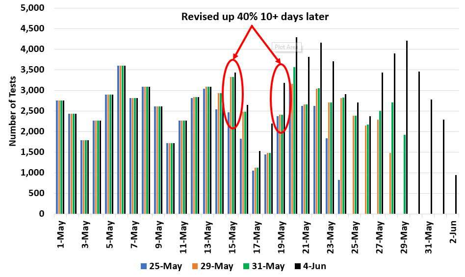
Here is a chart showing the number of tests reported by he day I downloaded the data.

OC Testing Numbers by Reporting Date

Now, I get that if I look at data on May 25th, the last couple of days may need revisions. But on May 29th, the data for May 15th (2 weeks!!!) was revised up by 40%.

The same thing happened on May 19th. That data was revised on June 4th, two weeks after the fact.

I have no idea what is going on with these major revisions, but it makes some analyses hard.