NASDAQ to NYSE Ratio

One of the amazing things the last couple of years as been the run in large tech names. The question is: will that run stick? As I mentioned on a previous post they can’t outperform forever.

Another way to look at the current environment is the ratio of the NASDAQ index to NYSE. Here is the ratio over time:

I’m not sure I need to add a lot of commentary to this graph, but this is the largest this ratio has ever been. I think some of this is permanent, but some of it is probably … temporary.
It’s Awful. Market hasn’t been this low since… Wimpy paid us for those burgers last Tuesday

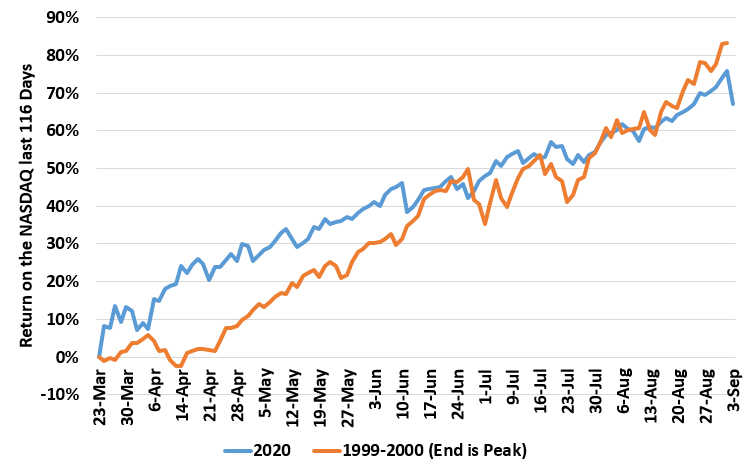
Tough day on the markets today. S&P 500 down 3%+ and NASDAQ down 5%. Is it time to buy the dip already? Let’s see the last 116 trading days.

Prices haven’t been this low since … since … last Tuesday! Must be time to buy.

Oh, and just for comparison, here’s the run in the NASDAQ the 116 days prior to the Tech bubble peak in 1999/2000. (End point is the peak.) Nothing to see there….