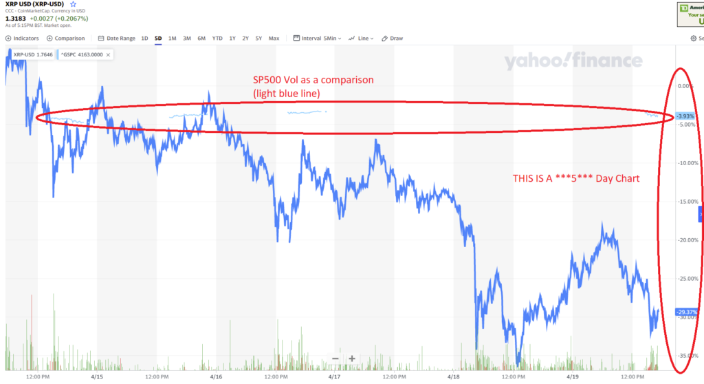
Anyone else look at charts of Crypto and need some dramamine? This is a 5 day chart of Ripple (XRP). It’s moved +/- 35% in 5 days. Just to compare, that what looks like flat blue line is the change in the S&P 500 in the same period. If only fiat currencies were this volatile we wouldn’t need these digital replacements.
